Explore All Resources
Search
Resource Type
Thematic
AHA Topics
Geographic

June 11, 2025
History of Tariffs

June 8, 2025
Guide for Contending with Online Harassment

April 7, 2025
History of the Federal Civil Service

March 13, 2025
History of Deportation
January 29, 2025
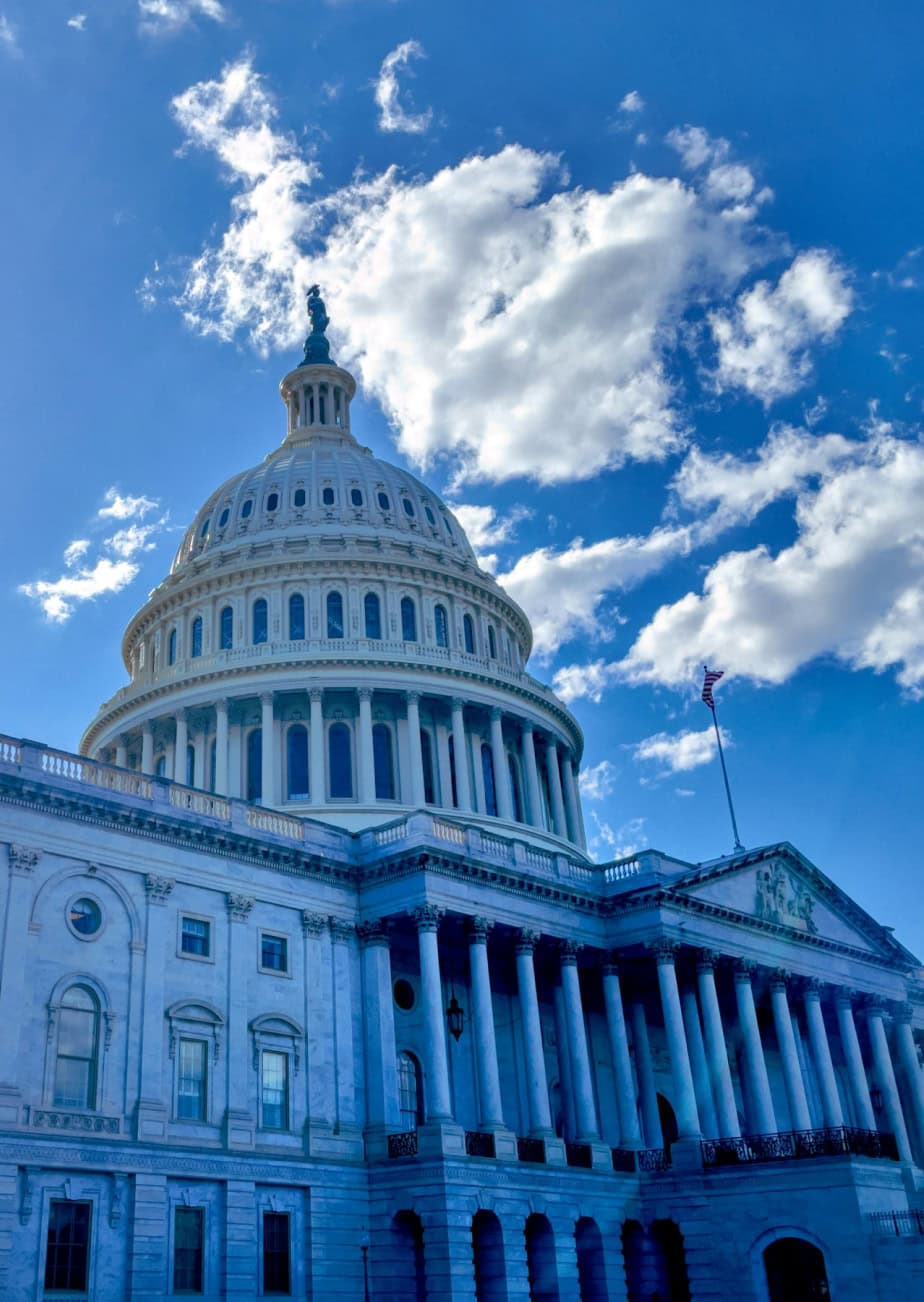
History of the US House of Representatives

January 9, 2025
Travel Policy
Academic Department Resources
History department chairs are on the front lines of the discipline, defending historians’ work and supporting their professional lives at all stages of their academic careers. The AHA strives to strengthen this work and provide resources and opportunities that make chairs’ work easier and valued. The AHA provides resources and hosts a variety of events and opportunities to benefit department chairs and build community, including webinars, sessions at the annual meeting, and an in-person workshop.
Current Events in Historical Context
The American Historical Association promotes the critical role of historical thinking in public life. These compilations of AHA resources provide historical context to important current events. These compilations of AHA resources provide historical context to important current events.
AHA Publications
AHA Reads
We invite you to participate in the fourth annual AHA Summer Reading Challenge. Participants will complete three (or more) reading tasks in the months of June, July, and August. These tasks encourage you to read widely—outside your field, your areas of expertise, and your personal experiences—and define “history” as nonfiction at any length (a book, an article, a chapter).

American Historical Review
The AHR has served as the journal of record for the historical discipline in the United States since 1895. It is the leading global forum for new scholarship in every major field of historical study across time and space.

Perspectives on History
Perspectives on History is the newsmagazine of the American Historical Association and is the principal source for news and information about the discipline of history.
AHA Booklets
Since the 1950s, the AHA has published booklets that address a diversity of topics to serve the needs of history students, educators, and professionals. Our publications include career advice for history graduates, overviews and syntheses of current historical topics and fields, and guides to teaching and learning in history. AHA booklets are distributed by Oxford University Press.
Events & Opportunities
Teaching with Primary Sources
The AHA is proud to partner with the Library of Congress in serving the Teaching with Primary Sources (TPS) Mid-Atlantic/US Territories Region. The TPS grant program furthers the Library’s mission to engage, inspire, and inform audiences across the country with a universal and enduring source of knowledge and creativity. Through the TPS Regional Program, the AHA issues subawards to a wide variety of organizations that plan to integrate the Library’s resources into educational programs.

October 24 - 25, 2025
2025 Texas Conference on Introductory History Courses
July 24, 2025
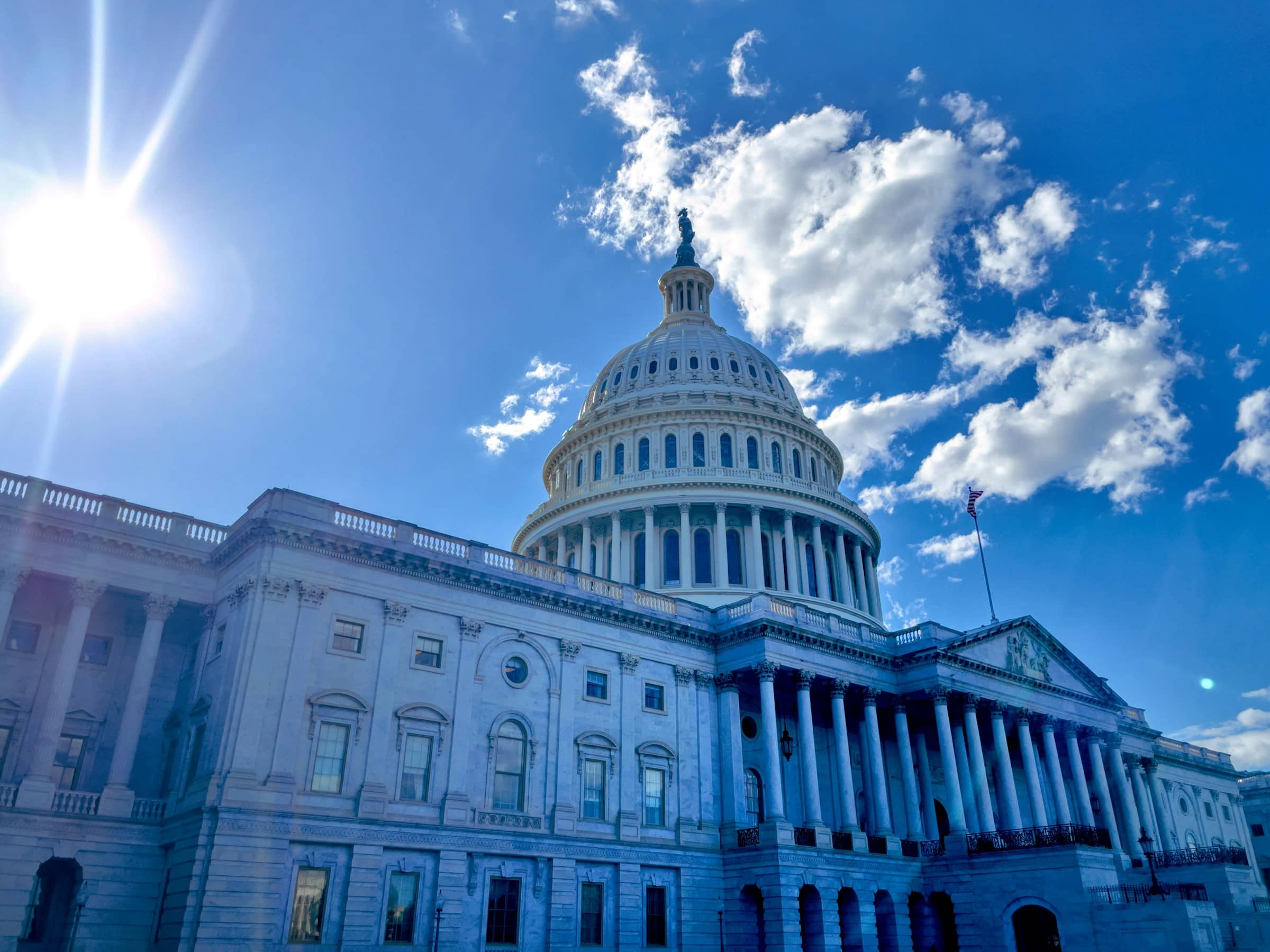
History of the US Senate

June 1 - 30, 2025