Material Culture in the Digital Frame
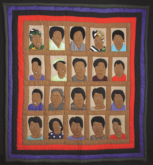
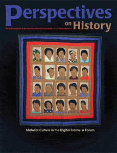
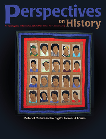
Anti-Apartheid Portraits Quilt, made c. 2003 by Fina Nkosi, Soweto, South Africa. Collection of the Michigan State University Museum.
Each block is a portrait of a black South African woman who played a key role in the anti-apartheid movement in South Africa. From left to right: Row 1: Winnie Mandela, Albertina Sisulu, Adelaide Thambo, Lindiwe, Thandi Modise. Row 2: Nokukhauya Huthuli, Lilliam Masediba Ngoy, Princess Constantine Magogo, Dudu Masondo, Stella Slgcawu. Row 3: Dipuwo Hanni, Florance Mkmize, Charlotte Maxeke, Dr. Ellen Khuzwayo, Princess Irenne. Row 4: Marry Nontolwane, Lilliam Ntshang, Felicia Mabuza- Suttle, Rose Givamanda, Kate (no last name given, but likely Kate Molale).
Staff