Historians in Collaboration
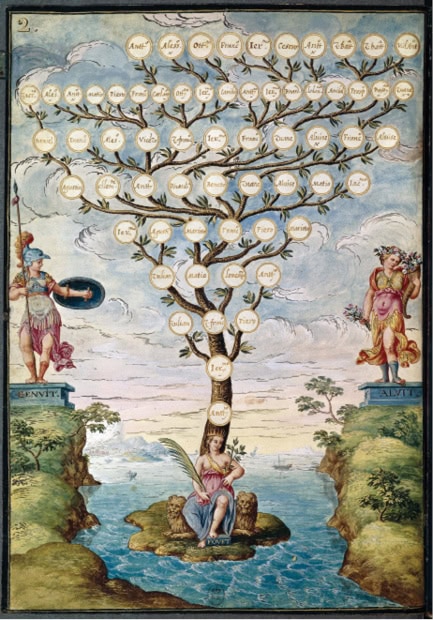
Inspired by Jacob Soll’s review of Manual Lima’s The Book of Trees, we found dozens of examples of the Tree of Life and the Tree of Knowledge from a range of cultures and traditions. Trees convey connections between earthy and celestial knowledge, taxonomies built around a strong central core, and, increasingly in the digital age, complex relationships and hierarchies.
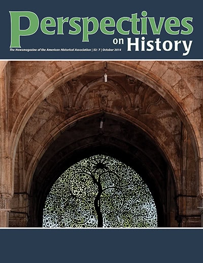
The tree that appears in this window screen of the Sidi Sayed mosque in Ahmedabad, India, was made in 1573. The mosque, still in use today, was built near the Sabarmati River in the Gujarat region. In Islamic traditions, the tree encompasses all. The Sufi author Ibn Al-‘Arabi named one of his treatises Shajarat Al-Kawn (The Universal Tree). This tree is imagined to be “at the navel of the earth, whose roots go down to the deepest reaches of the underworld, whose branches extend to embrace east and west, and whose topmost branches penetrate to the highest heaven. . . . The Prophet Muhammad is concerned with the root of this Tree, but also with its fruits, and with the Tree of Life mentioned in Sura XXIV, 35, the blessed olive tree,” writes Arthur Jeffery in “Ibn Al-‘Arabi’s Shajarat Al-Kawn” (Studia Islamica 10 [1959], pp. 43-77). The photo on the cover was taken by Hardik Trivedi (CC-BY-SA 3.0).
Staff