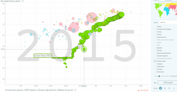
“Wait, what just happened?” exclaimed one of my students. Last year, my US history class and I spent a day with Gapminder, a graph-based visualization program that charts more than 50 different historical indicators, from per-capita income, birth rate, and life expectancy to coal consumption and Internet use, on a Cartesian x-y axis over the course of 200+ years of world history.

Gapminder is a graph-based visualization tool that charts more than 50 different historical indicators on a Cartesian x-y axis over the course of 200+ years of world history. This image uses the tool to show drop in US life expectancy in 1918.
The graph we were looking at had a watermark that read 1918 and more than 50 bubbles, each representing a different country, that plunged down the y axis, labeled life expectancy. One student identified the 1918 flu pandemic as the cause for the drop, while another discussed famine in Europe after World War I. We restarted the visualization, and watched the watermark tick from 1800 to 2015 as the bubbles rose and fell, and moved left and right based on countries’ life expectancy and per-capita income. This time, the discussion turned into a heated debate over sourcing, representation, and “objectivity.” My students, with little prompting from me, asked where the program got its data from—why did it include some countries but exclude others? What did it mean to have a region represented as a country when that country did not yet exist? Through Gapminder, my students were able to explore continuities and changes around the world across two centuries, while critically thinking about the ways that nationalism, representation, and misuse of statistics can shape our understanding of the past and present.
Gapminder, an impressive archive of data with a visualization tool that aims to “promote a fact-based worldview,” is the most well-known part of the Gapminder Foundation. Started in 2005 by Ola Rosling, Anna Rosling Rönnlund, and Hans Rosling, the Gapminder Foundation has the lofty goal of “promoting sustainable global development and achievement of the United Nations Millennium Development Goals.” The foundation, and more particularly Gapminder, saw a sudden boost in popularity in February 2006 when Hans Rosling, also an academic in Sweden, gave what would become one of the most popular TED Talks of all time. Using an early version of Gapminder, Rosling examined the ways that life expectancy and other health indicators have improved worldwide over the past 100 years. The Gapminder site also includes a series of teaching modules that offer specific lesson plans on how to use its tools in K–12 classrooms.
On the most practical level, Gapminder is an immediately accessible project that grabs students’ attention and opens up broader discussions. In my classroom, I usually use it as a review of the modern era. The simplicity of bubbles moving up and down, left and right seems to stick with students as they see the historical events they’ve studied made manifest on a simple two-coordinate graph. I begin with the program defaults, life expectancy on the y axis and per-capita income on the x axis, quickly identifying the watermark and explaining the ways that the different colors apply to various regions and that size is equal to population.
The conversation usually tracks the order identified in the introduction: from curiosity to excitement to critique. I try to start the critique by looking at the data. Where does it come from? The answer is a compilation of data sets, ranging from historical compendiums to data from the World Health Organization to the American Economic Review. Why did they choose one data set over the other? Can we trust this data? Does it matter if there is some data we can, and some data we can’t, trust? How does the context of us using the tool, in a classroom, vary from the context for which it was created—info-tainment? I emphasize that while the program is not trying to mislead us, we should critically think about the information that it, and other visualizations like it, purports to provide. The “Data Doubts” button located in the lower right corner of the graph is particularly helpful here.
Then, I move the class to an examination of the structure and narrative of the graph. Where does the axis’ scale, logarithmic or linear, switch? Why? How does that change our understanding of the graph? Why are some countries represented as independent entities long before they even existed? Why and how does this reify the nation state? Why did the project designers make these choices? What argument is the project making? Is this visualization misleading us to drive a narrative? Here I encourage them to engage the project in good faith, assuming that the design choices are meant to further public understanding, rather than critical scholarship. This is a valuable way of discussing the ways that context shapes both presentation and understanding. Then I show them the TED Talk, telling them about its enormous popularity. What makes Gapminder so compelling to millions of people?
Finally, after the students have finished critiquing the program, I circle back to the place that this project has in our class. How does it reinforce, contradict, or qualify the material we have covered in this course? I ask them to reflect and take what my undergraduate mentor, Karen Eifler, calls a “pedagogical pause.” Why did I show them this project, with its methodological and conceptual problems, to them? What is the value in viewing and discussing it? How does it help them better understand the past and, just as importantly, their present?
For instructors pressed for time, Gapminder offers a powerful tool for combining a variety of historical thinking skills with solid content review. Within the space of one class period students review broad historical trends of the past 200 years, hone their data literacy skills, interrogate the primacy of the nation state, and reflect on the ways they learn. Included below is a project that asks students to use Gapminder to contextualize a country’s demographic changes amongst broader world historical trends. Gapminder also contains a variety of lesson plans and alternative visualizations that further explore the world using its unique blend of data and verve.
Sample Assignment: Contextualizing Gapminder
Let me know in the comments or via Twitter (@johnrosinbum) how you use Gapminder in your classroom. It’s a unique tool that opens up so many possibilities for critical thinking. Next month we’ll examine one of the most exciting digital atlases out there, American Panorama. Until then, enjoy the end of the semester, and I look forward to hearing from you!
This post first appeared on AHA Today.
This work is licensed under a Creative Commons Attribution-NonCommercial-NoDerivatives 4.0 International License. Attribution must provide author name, article title, Perspectives on History, date of publication, and a link to this page. This license applies only to the article, not to text or images used here by permission.


