The Presence of Absence
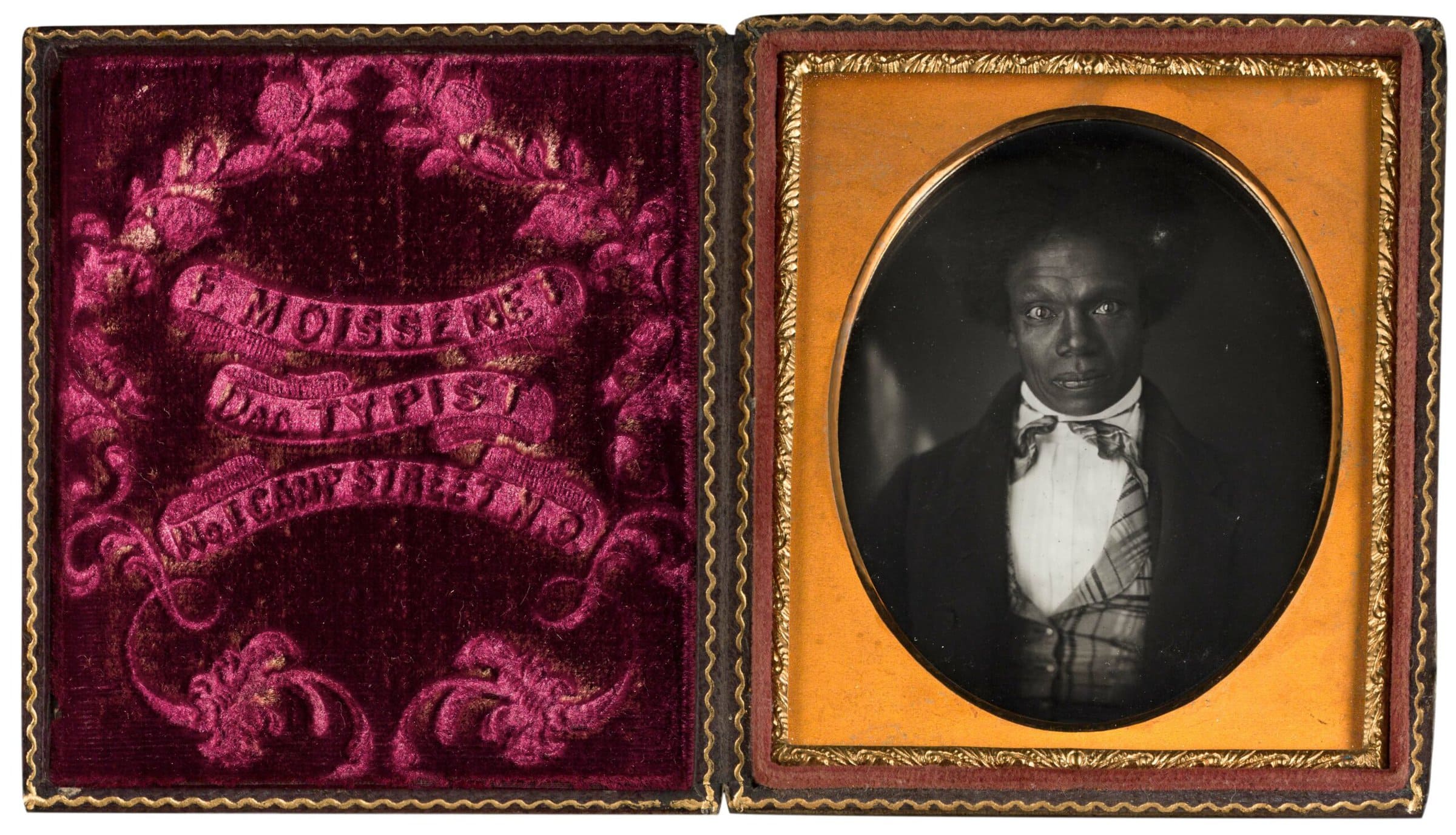
It’s an odd turn of phrase, for one to say that they can sense that something is missing. They cannot, after all, see, smell, taste, hear, or touch an absence. In this issue, two authors work to sense, articulate, and address a missing presence. In “Missing Women,” Bridget Riley explores how she uses a podcast assignment to tackle the gender imbalance in middle school social studies textbooks. Brian Piper considers how an unnamed Black man used the visual and tactile nature of a daguerreotype to assert his presence when “so much of America’s visual culture distorted or denied his existence.” Recognizing the presence of these absences requires the question: what are the other missing pieces in history?
Image: Felix Moissenet, Portrait of a Man, ca. 1852. Daguerreotype, 3¼ × 2¾ inches. New Orleans Museum of Art, Museum Purchase, Maya and James Brace Fund, 2013.22. Available to view by appointment.

Staff